")
Top 7 Ways to Choose Beautiful, Professional Fonts for Your Designs (2025 Guide)
According to the Design Trend Report 2024, 78% of viewers decide whether a design looks professional within the first 3 seconds — and typography is the biggest factor.
In other words, choosing the wrong font can instantly reduce trust, weaken your message, and lower conversions.
Whether you’re designing a flyer, brochure, business card, poster or banner, this guide will show you how to choose fonts that look clean, modern, and print perfectly every time.
1. Choose Fonts Based on the Purpose of Your Design
Every design has a goal, and your font must support that goal.
“Typography isn’t just decoration — it guides the viewer’s attention.”
2025 Trend Highlights
- Minimal sans-serif fonts
- Rounded, friendly typefaces
- Elegant serif fonts for premium branding
Why it matters
- Better readability
- Stronger hierarchy
- A more polished, professional look
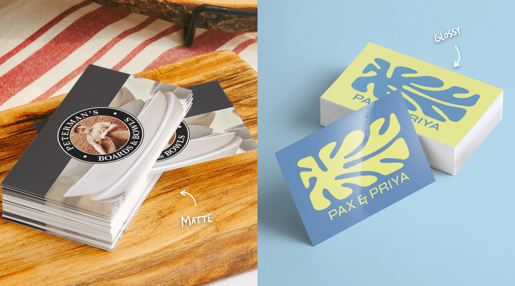
Explore high-quality Business Card
2. Limit Your Design to 2–3 Fonts
Consistency is key. Using too many fonts makes your design look messy.
“Beautiful designs use fewer fonts — but choose them wisely.”
Popular Pairings for 2025
- Montserrat + Lora
- Helvetica Neue + Georgia
- Poppins + Merriweather
Why this works
- Cleaner visual structure
- Stronger brand identity
- Easier for the viewer to follow
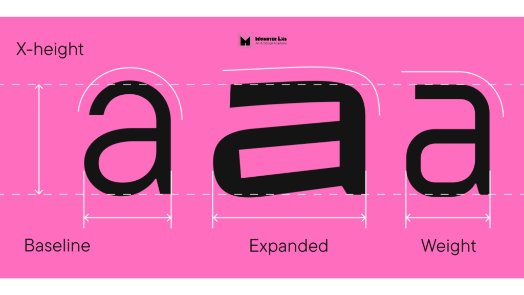
3. Optimise Spacing: Kerning – Tracking – Leading
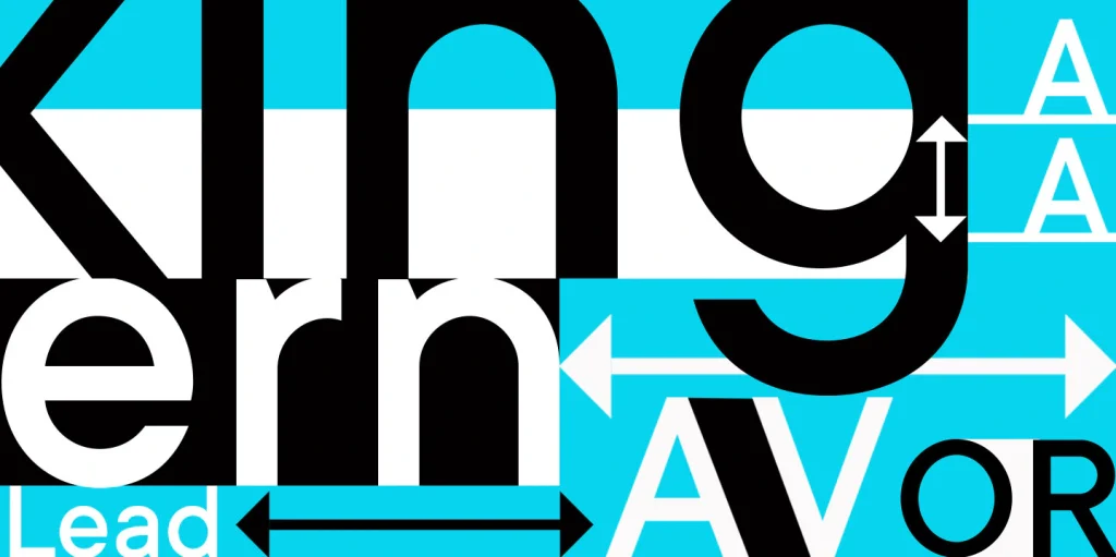
Even the most beautiful font looks wrong with poor spacing.
2025 Spacing Trends
- Slightly wider letter spacing
- Taller line height for cleaner layouts
Benefits
- Balanced headlines
- Easier-to-read body text
- Sharper print output
- Print professionally designed Flyers at Coast Print.
4. Use High-Quality Free Fonts
There are over 40,000+ free fonts, but not all are suitable for print.
Recommended Free Fonts for 2025
- Inter
- Poppins
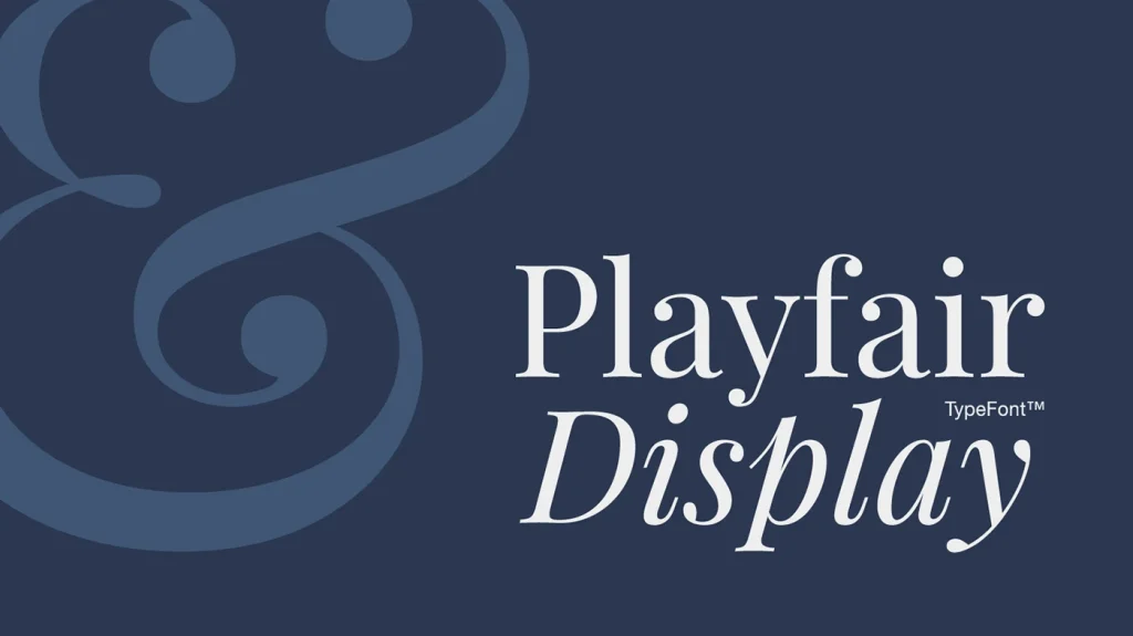
- Playfair Display
- Libre Baskerville
- Work Sans
Why these fonts work
- Clean strokes for printing
- Clear licensing
- Consistent cross-platform rendering
Pro Tip: Always download OTF/TTF files and check licensing before use.
5. Choose Fonts That Print Cleanly (Offset & Digital)
For print, you need fonts with solid contrast and clear structure.
Avoid overly thin, overly decorative, or compressed fonts.
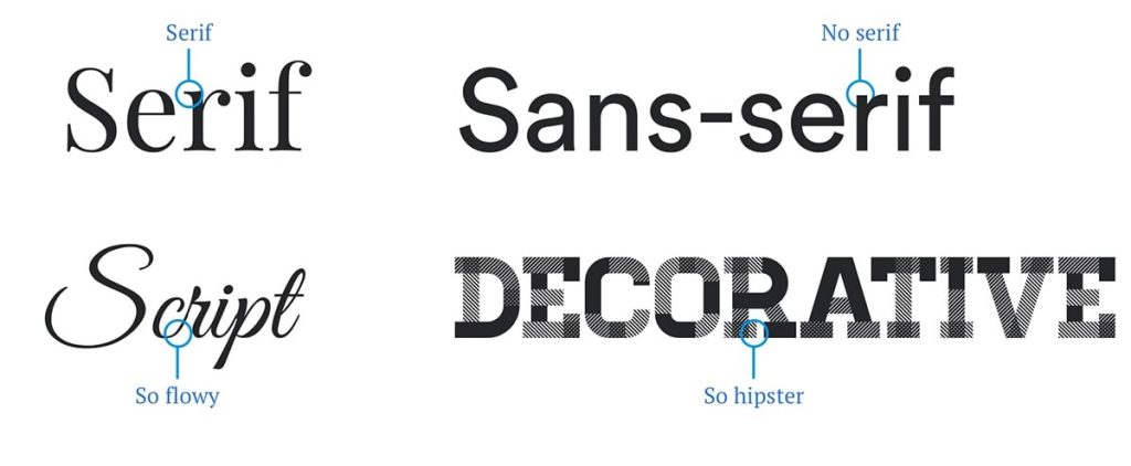
Best choices for printing
- Sans-serif for long text
- Serif for elegant titles
- Display fonts for attention-grabbing banners
Why it matters
- Sharp output at large sizes
- Reduced risk of blurring
- Stronger visual impact
View our Poster & Banner options.
6. Use Brand Fonts for Consistency
If you’re designing for a business, brand typography is essential.
2025 Branding Trends
- Softer rounded fonts
- Neutral tones paired with minimalist fonts
- High-contrast serif titles
Benefits
- Stronger brand recognition
- Cohesive look across all materials
- Professional and trustworthy impression
7. Always Check Your Fonts Before Sending to Print

This is the step that prevents 90% of printing issues.
“A small font error can lead to reprints — always proof before printing.”
Quick Pre-Print Checklist
- Embed fonts in the PDF
- Convert colours to CMYK
- Avoid rare or unsupported fonts
- Test readability at A5, A4, and A3 sizes
Send your file to Coast Print for a free pre-print check.
FAQ
1. What are the best fonts to use for printing?
For professional printing, choose fonts with clean strokes and good legibility.
Recommended options:
- Sans-serif: Inter, Helvetica, Poppins, Proxima Nova
- Serif: Playfair Display, Georgia, Libre Baskerville
- Display: Use only for headlines or banners
These fonts render well in both digital and offset printing.
2. How many fonts should I use in one design?
The ideal number is 2–3 fonts:
- One for headings
- One for body text
- One optional accent font
Using more than three can make your layout look cluttered and unprofessional.
3. What is the best font size for printed materials?
Recommended font sizes for print:
- Body text: 9–12 pt
- Headings: 18–48 pt
- Large banners/posters: 60–150 pt
Always test your design at real-world sizes before final printing.
4. Why do my fonts look different when printed?
This can happen due to:
- Fonts not embedded in the PDF
- Wrong colour mode (RGB instead of CMYK)
- Low resolution or poor-quality typeface
- Printer limitations or scaling issues
Always export using PDF/X-1a or PDF Print Ready with embedded fonts.
5. Do I need to convert text to outlines before printing?
Converting text to outlines is optional but recommended when:
- Using custom or uncommon fonts
- Sending files to multiple print vendors
- Avoiding font substitution errors
However, embedding the font in your PDF is usually enough.
6. What spacing settings improve readability?
Typography spacing guidelines:
- Kerning: Adjust pairs like “AV”, “WA”, “To”
- Tracking: +10 to +30 for modern headings
- Leading: 1.3–1.6× line height for paragraphs
Good spacing makes your print look cleaner and more premium.
7. How do I choose fonts for my brand?
Follow this structure:
- Primary Font: For titles (serif or modern sans-serif)
- Secondary Font: For body text
- Accent Font: For highlights or taglines
Your brand fonts should reflect your personality — modern, elegant, friendly, or bold.
8. Which fonts should I avoid for print?
Avoid:
- Ultra-thin fonts
- Overly decorative script fonts
- Low-quality free fonts
- Fonts with poor kerning
- Fonts that distort at large sizes
These usually print poorly, especially on large-format materials.
9. Should I use RGB or CMYK for printed text?
Always use CMYK for print. RGB is only for screens.
If text is exported in RGB, colours may shift and appear dull when printed.
10. Can Coast Print help me check my typography before printing?
Absolutely!
Coast Print offers free file preflight checks, ensuring your fonts, spacing, bleed, DPI, and CMYK settings are all correct before printing.
Conclusion : The Right Font = Professional, High-Impact Design
By applying these 7 typography principles, your designs will instantly look:
- Cleaner
- More modern
- Easier to read
- Better aligned with 2025 print trends
- Fully ready for commercial printing
At Coast Print, we support you from design to file checking to premium printing, ensuring every project looks its best.
Explore Coast Print full range of professional printing products:
- Business Cards
- Flyers
- Brochures
- Posters & Banners