How to Design Signage That Truly Attracts Customers : The Art of Being Seen
Some signs you walk past without thinking.
Others make you stop. Turn your head. Walk closer.
Sometimes… even step inside.
Why?
Because great signage isn’t just design.
It’s emotion, clarity, and invitation , all captured in a single moment.
At Coast Print, we’ve watched countless cafés, real estate offices, retail stores, salons and service businesses transform simply by upgrading one thing:
Their signage.
This is the story of how powerful signage is created
and how you can design signs that don’t just exist… but attract.
1. Begin With the Moment You Want to Create
Before choosing colours or fonts, ask yourself:
“What do I want someone to feel when they see this sign?”
- Excited?
- Curious?
- Comforted?
- Ready to buy?
- Ready to walk in?
A sign is not decoration.
It’s an emotional trigger.
“Great signage doesn’t speak to everyone. It speaks directly to the right person.”
When you start with emotion, the design that follows becomes sharper, clearer and more effective.
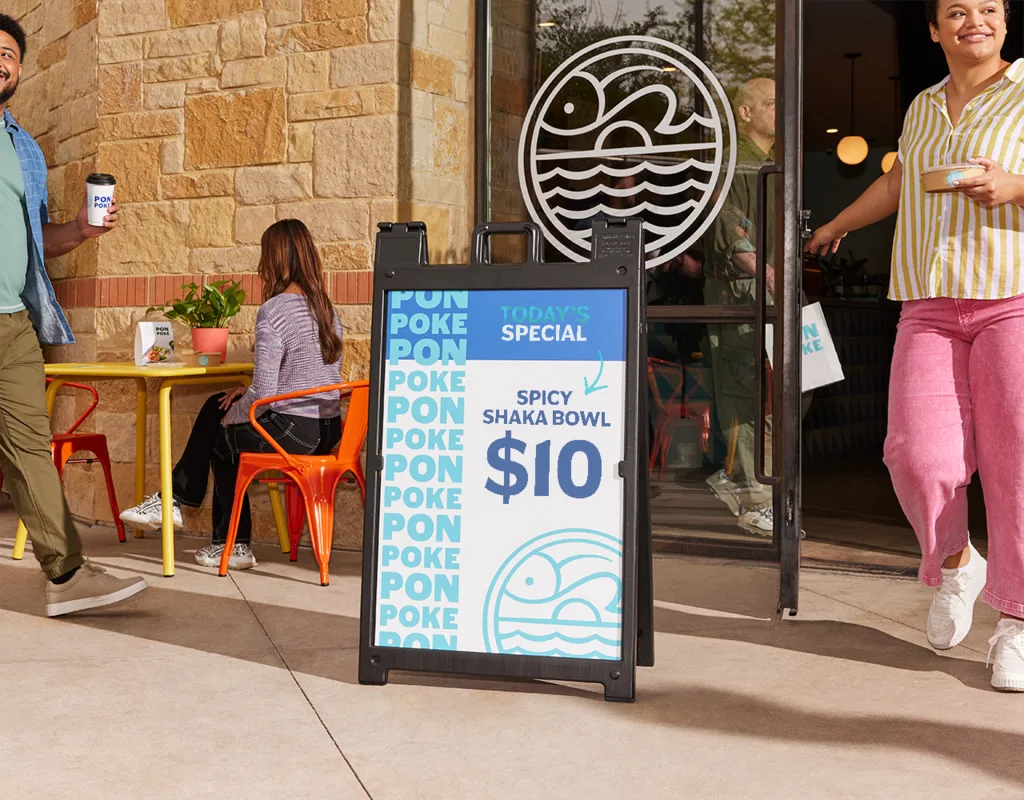
2. Clarity Wins: Make Your Message Instantly Understandable

People don’t stand still to read your sign.
They glance.
They skim.
They decide in seconds.
This is why the most successful signs follow one rule:
One message. One purpose. One action.
Examples that work:
- “Fresh Coffee – Open Now”
- “Custom Printing While You Wait”
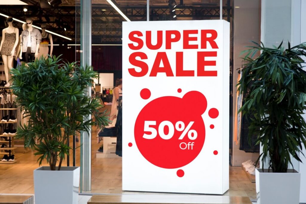
- “Sale – Up to 40% Off”
- “Walk-Ins Welcome”
Say less → impact more.
3. Typography: Big, Bold & Beautiful
The right font can pull attention from across the street.
The wrong font can make your sign invisible.
What works:
- Bold, clean sans-serifs
- Large text (much bigger than you think!)
- Strong contrast
- Minimal decorative fonts
What to avoid:
- Thin scripts
- Tiny lettering
- Busy, complex typefaces
“If it can’t be read in 2 seconds, it’s not working.”
Need guidance? Explore Design Tips & Templates
4. Colour Contrast: Your Secret Weapon
Colour sets the tone — but contrast creates visibility.
High-performing colour pairs:
- White on navy
- Black on yellow
- Red on white
- Black on orange
- White on forest green
Avoid:
- Yellow on white
- Pastel on pastel
- Blue on dark blue
Your sign should be readable from the footpath — even under bright sunlight.
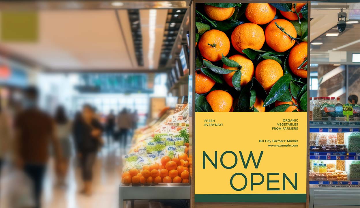
5. Let Images Tell the Story Before Words Do
Humans react to visuals before text.
A single image can communicate everything you want someone to feel.
Use images that:
- Feel real (not generic stock)
- Match your brand personality
- Highlight the benefit, not just the product
- Spark curiosity
If your signage can make someone imagine themselves as your customer… you’ve already won.
6. White Space Creates Confidence
Most businesses try to fill every corner of their sign.
But the best signage?
It breathes.
White space gives your message strength and confidence.
It signals quality and calm.
It elevates your brand instantly.
“White space is not empty — it’s powerful.”
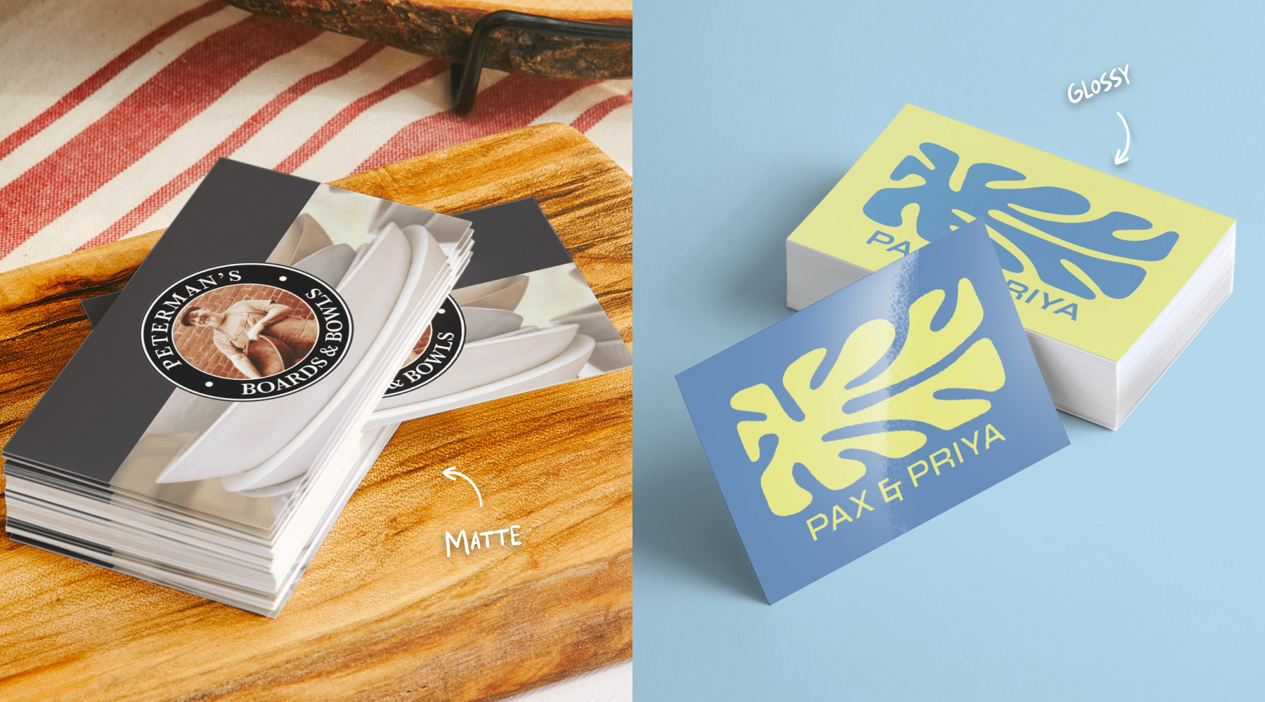
7. Materials Matter – Choose What Reflects Your Brand
Different materials send different messages:
Indoor:
- Foam boards → light, clean, modern
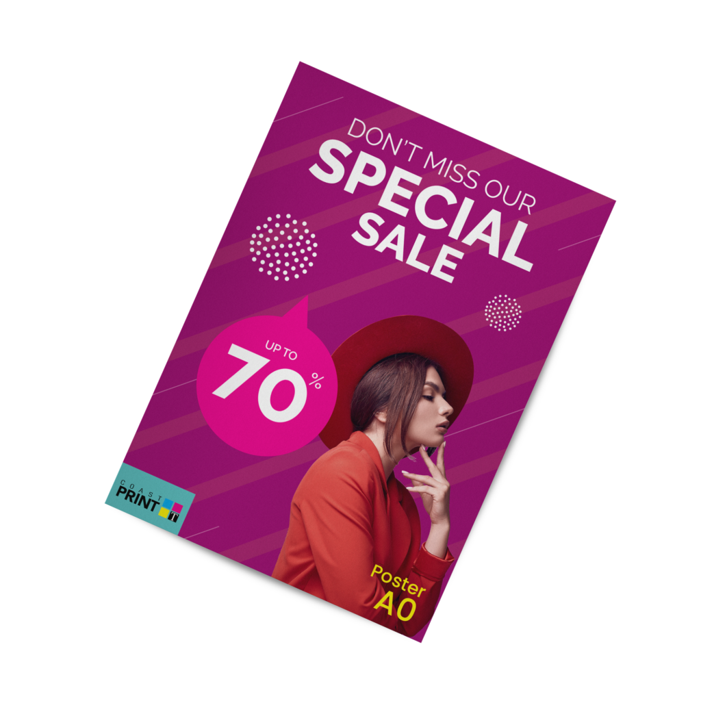
- Posters → affordable, versatile
- Window decals → perfect for promotions
- Vinyl stickers → high impact
Outdoor:
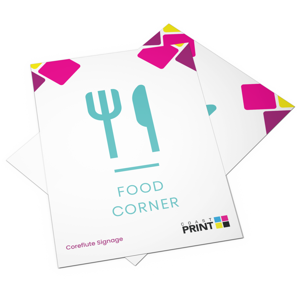
- Corflute signs → durable & cost-effective
- Pull-up banners → portable & professional
- Mesh banners → wind-resistant for outdoors
- ACM panels → premium, long-lasting signage
A luxury salon needs a different material than a busy café.
Your signage should feel like you.
View Coast Print’s Posters & Banners
8. Placement: Where Eyes Naturally Go
Even the perfect sign fails in the wrong place.
Consider:
- Eye-level positioning
- Traffic flow
- Viewing distance
- Lighting & reflections
- Standing vs driving audience
A well-placed mediocre sign outperforms a beautiful sign hidden in the shadows.
9. Add a Clear Call to Action
Your sign should lead viewers somewhere — into your store, onto your website, into your message.
High-impact CTAs:
- “Order Online Today”
- “Visit Us Inside”
- “Scan to View Menu”
- “Book a Consultation”
- “Enquire Here”
CTAs turn attention into action.
Explore Custom Signage Printing
FAQ
1. What size should my signage be?
It depends on the distance:
- Footpath viewers: A3–A1
- Roadside viewers: Large banners or ACM panels
2. What colours attract the most attention?
High-contrast combinations like black/yellow, navy/white, red/white.
3. How many words should I use?
Aim for 3–7 words. Shorter = stronger.
4. Which font style works best for readability?
Bold, simple sans-serif fonts (e.g., Montserrat, Helvetica, Poppins).
5. Can Coast Print help design my signage?
Yes — we provide layout guidance, material selection, and premium printing.
Conclusion :Your Sign Is Your Silent Salesperson
A great sign never stops working.
It represents you at 7am when the city wakes up…
At 3pm when school traffic flows…
At 9pm when the streets are quiet.
When designed with intention and printed with care, signage becomes:
- A storyteller
- A brand ambassador
- A guide
- A magnet
- A moment of connection
At Coast Print, we help businesses across Geelong, Armstrong Creek, Torquay and the Bellarine Peninsula design signage that gets seen — and remembered.
Start your signage project with Coast Print today.