How to Create Eye-Catching Signage That Attracts Customers”
There’s a moment every business dreams of .
A passerby slows down, turns their head, and walks in…
all because your signage whispered the right message at the right time.
It wasn’t loud.
It wasn’t flashy.
It was simply unforgettable.
Great signage doesn’t shout : it invites.
It doesn’t overwhelm: it guides.
And in a world filled with noise, the right sign becomes a quiet magnet that draws people in.
At Coast Print ,we’ve seen cafés double foot traffic, retailers boost walk-ins, and real estate offices increase enquiries…
all from powerful, thoughtfully designed signage.
Let’s dive into how you can create signage that doesn’t just show your brand,
it gets your brand noticed.
1. Start With a Clear Purpose : What Do You Want People to Do?

Before choosing colours, fonts, or shapes, ask yourself:
“What is the ONE thing I want people to do when they see this sign?”
- Come inside?
- Notice a promotion?
- Learn your brand name?
- Feel curious?
A sign without purpose is just decoration.
A sign with intention becomes a silent salesperson working 24/7.
“The clearest signs get the most attention.”
2. Choose Bold, Clean, Easy-to-Read Fonts
Imagine someone driving past your shop at 40 km/h.
Do you think they can read a thin cursive script in time?
Typography makes or breaks your sign.
Rules for high-impact font choices:
- Use bold, sans-serif fonts for headlines
- Avoid overly decorative fonts
- Keep text large — much larger than you think
- Prioritise readability over style
If people can’t read it instantly, the message is lost.
Need help choosing fonts? Explore Design Tips & Templates
3. Colour Contrast Is Everything
Colour isn’t just visual : it’s emotional.
It tells your brand story before a single word is read.
High-impact colour strategies:
- Dark text on a light background (or vice versa)
- Use brand colours sparingly and purposefully
- Never place similar tones together (yellow on white, blue on navy…)
Your sign must stand out from across the street, not just at arm’s length.
“If it blends in, it disappears.”

4. Make It Simple : The Rule of One Message
The most effective signage follows the Rule of One:
One message
One action
One visual focus
Because the human brain can only absorb so much in a second.
Examples of simple, high-converting messaging:
- “Fresh Coffee → Open Now”
- “Custom Printing While You Wait”
- “Sale – Up to 40% Off”
Simplicity isn’t boring , it’s powerful.

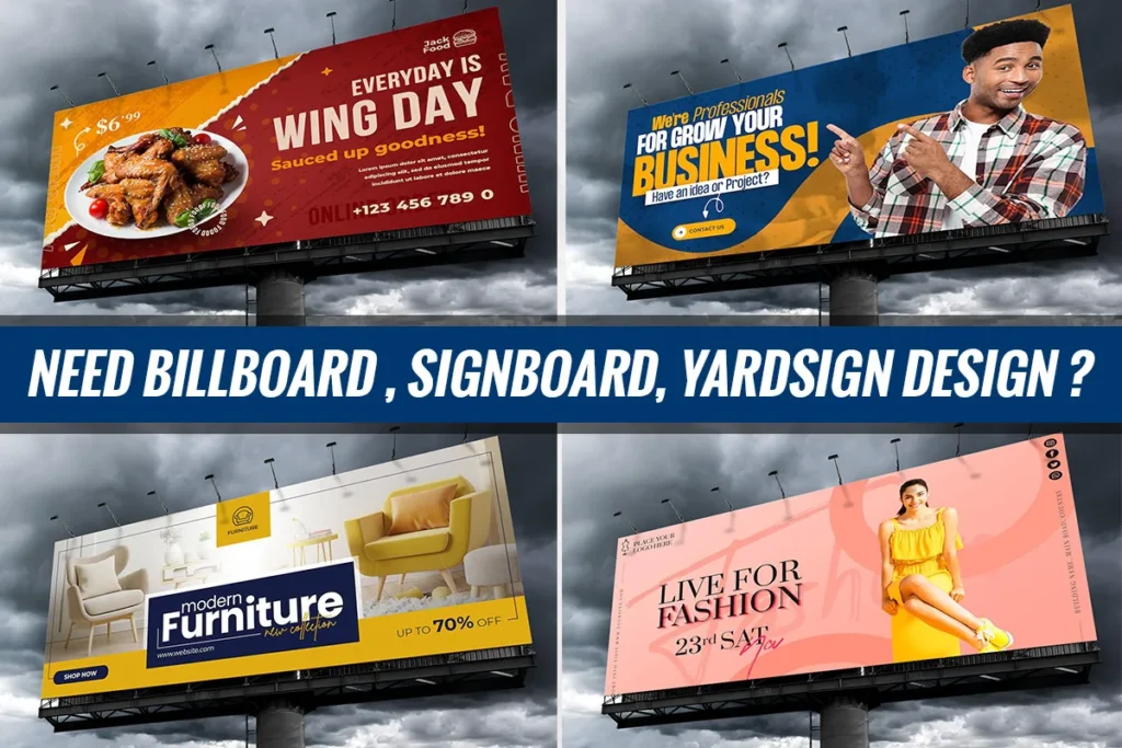
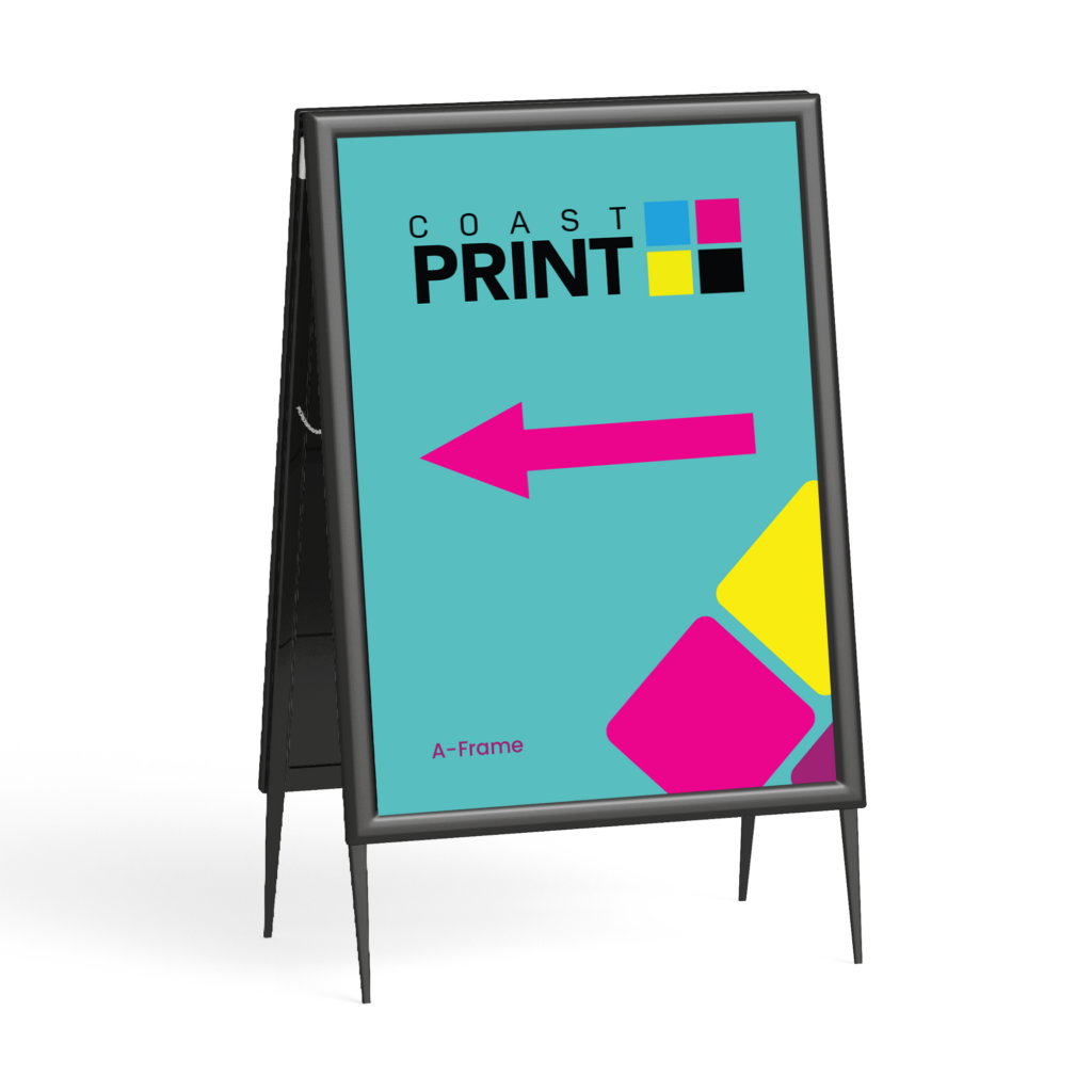
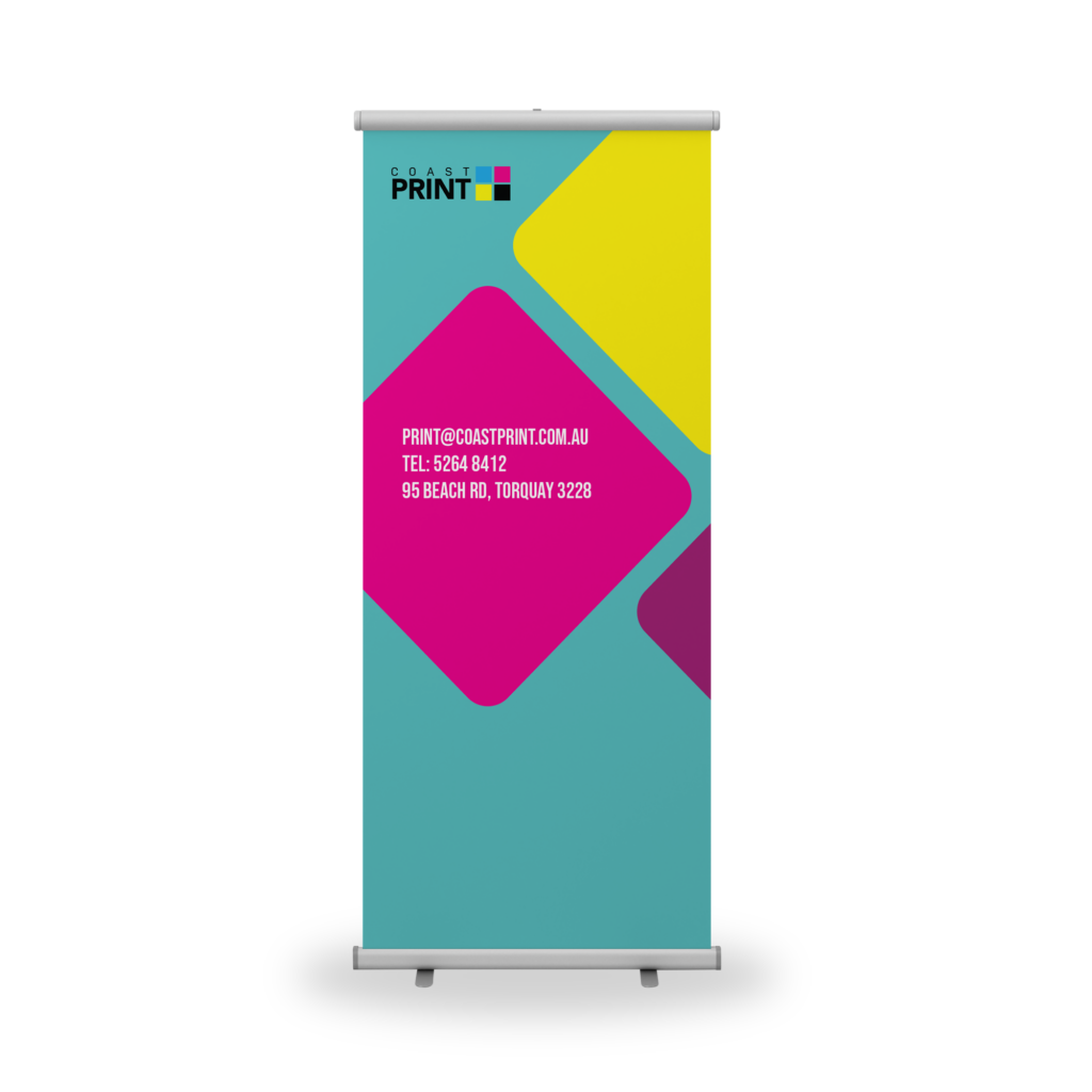
5. Use the Right Materials for the Right Environment
The material you choose impacts durability, visibility, and customer perception.
Indoor Signage:
- Foam board
- Posters
- Window decals
- Vinyl stickers
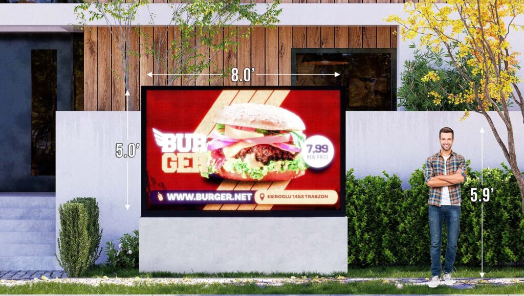
Outdoor Signage:
- Corflute signs
- Pull-up banners
- PVC or mesh banners
- Aluminium composite panels (ACM)
Each serves a different purpose : marketing, wayfinding, branding, or promotion.
View Coast Print’s Posters & Banners collection
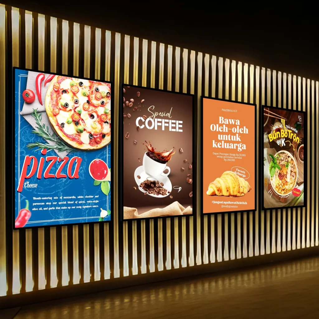
6. Add Visuals That Capture Attention Instantly
Humans process images 60,000 times faster than text.
A great visual can communicate more than a paragraph ever could.
Use visuals that:
- Show people using your product
- Highlight the core benefit
- Spark emotion instantly
- Match your brand personality
And remember: authentic photos > fake stock images.
7. Harness the Power of White Space
White space isn’t empty : it’s strategic.
It gives your message room to breathe, helping your sign feel modern, confident, and readable.
Many businesses try to “fill” every corner.
But great signage knows when to say less.
“White space is the pause that makes your message louder.”
8. Place Your Sign Where Eyes Naturally Go
Even the best sign fails in the wrong location.
Think about:
- Eye-level visibility
- Traffic flow
- Sunlight direction
- Walking vs driving audiences
- Competing signage nearby
Strategic placement often outperforms even the most expensive design.
9. Use a Strong Call to Action
Your sign should guide the viewer toward a next step.
Examples of effective CTAs:
- “Order Online Today”
- “Visit Us Inside”
- “Scan for Menu”
- “Join Our Community”
A CTA transforms your sign from decoration into conversion.
Explore custom Signage Printing options
FAQ
1. What size should my signage be?
Larger signs work best for outdoor viewing; DL/A3/A2 sizes suit indoor displays.
2. Which materials are best for outdoor signs?
Corflute, PVC, mesh banners, and ACM panels are durable and weather-resistant.
3. How many words should my sign have?
Aim for 3–7 words for maximum visibility.
4. What colours stand out the most?
High-contrast pairs like black & yellow, navy & white, red & white, and black & orange.
5. Can Coast Print help design my signage?
Yes : we can support design, materials, layout, and printing.
Contact Coast Print for signage design support
Conclusion : Your Sign Is Your First Impression
Signage is more than a piece of marketing —
it’s the moment your business becomes visible.
A great sign can:
- Stop someone in their tracks
- Spark curiosity
- Build brand recognition
- Increase walk-ins
- Boost sales
- Tell your story… in a single glance
At Coast Print, we help transform simple signage into powerful brand moments — signs that don’t just get seen, but get remembered.
Start your signage project with Coast Print today.